
Blog
Root-causing a cost spike with the event overlay, start to finish
Knowing a number changed is the easy half. Knowing why it changed is where the afternoon goes. This is a walkthrough of what closing that gap actually looks like, using the same illustrative spike shown on the homepage: a cloud spend line that goes from steady to a 3.5x climb over about ten weeks.
The setup
An account is tracking AWS spend at a flat ~$25k/month through early April. Nothing unusual. The kind of number a team stops checking closely once it’s been stable for a while.
Step 1: the spike shows up
By mid-June the same line reads $86.5k. That’s 3.5x, with no single dramatic jump. Just a steady climb, easy to miss week-to-week and impossible to ignore across the full quarter. On a tool that only shows the total, this is where the manual work starts: pull up the deploy history, check with the infra channel, cross-reference the CRM, hope someone remembers what shipped in mid-April.
Step 2: what the timeline shows
With the event overlay turned on, the same chart carries four markers instead of a blank line:
- Apr 15 · PR merged:
api-gateway v2.4, right where the slope first breaks from flat. - May 12 · Client onboarded: Acme Corp, a new account whose usage pattern doesn’t match anything already provisioned for.
- May 24 · Capacity ticket opened:
INFRA-482, raising the autoscale ceiling. Someone already saw this coming and acted on it. - Jun 5 · Incident resolved: the cluster auto-scaled through a traffic spike rather than falling over. Good news operationally, and the reason the spend curve keeps climbing instead of flattening back out.
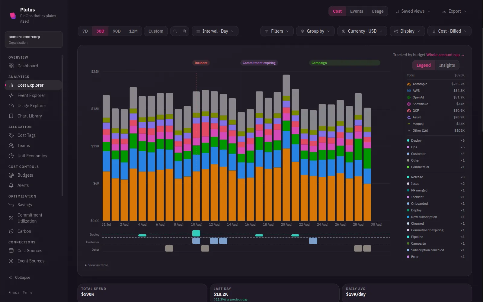
Read left to right, that’s not four unrelated facts, it’s a story: a release changed how a service scales, a new customer’s traffic pattern stressed it, someone filed a ticket raising headroom in response, and the infrastructure did exactly what it was told to do during the next spike. The chart and the explanation are the same object. There’s no second tool to open.
Step 3: closing the loop
Neither side has to cross into the other’s tool. Finance doesn’t page an engineer, and engineering doesn’t context-switch into a billing dashboard. Whoever’s looking at the chart can see the answer without asking anyone a question first. The overlay does not make the chart prettier. It shortens the path from “costs are up” to “here’s why, and here’s whether that’s a problem.”
If a chart doesn’t come with that answer attached today, that gap is worth pricing. It’s the time your team spends re-deriving the story behind every spike, one Slack thread at a time.
See the interactive version on the homepage →, or get started free. No credit card required.